The complicated spectrum of data graphics and getting started with charts!
We’ll examine an inherent conflict of data visualizations (especially where this class is concerned) and then get our hands dirty with some basic charts in R and D3.
Quick links
R console R charts JS console D3 charts
Housekeeping
Going over some things that we might have missed in the first class: preferred email addresses, clss Google group, how to email us, office hours, classroom behavior, what our starting skills are (and why that’s hard), open questions.
Who’s here
Critique
Shan and Kevin (Shavin) will give an example of the kind of critique we’ll be expecting you to do in subsequent classes. Details are on the class home page. They’ll be discussing one of the first “journalistic” Twitter maps, which they both worked on, sort of. On your own time, you might or might not read this article by Jake Harris about problems using Twitter data.
Lecture
The essence vs. the fiddly bits of data graphics, and understanding chart types.
Lab
We’ll make some bar charts with R and D3, but mostly we’ll get familiar with the console and environments of each. We’ll be replicating Kevin’s favorite bar chart of 2013.
Creating a new project
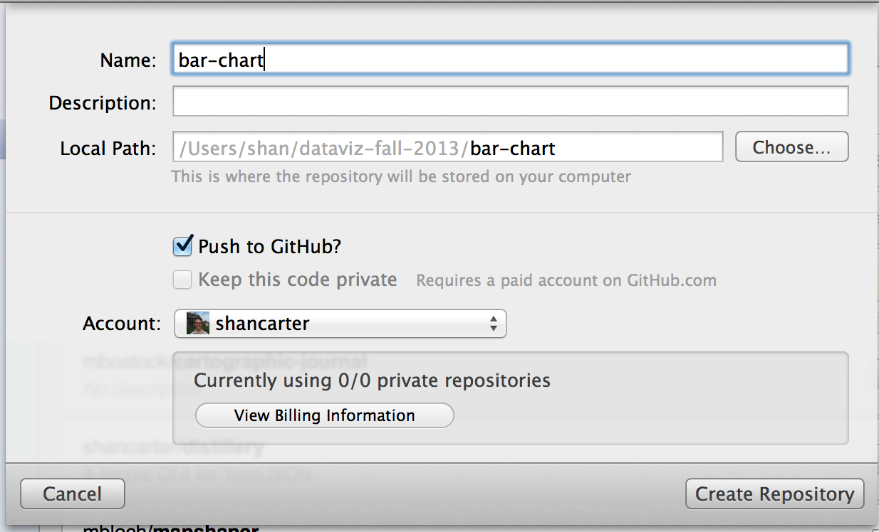
Let’s review a bit and create a new repo in github for our project. Previously we created the repo on the github website, but today we’ll use the app
Create a new repo with the github “cat” app. There’s a plus button at the bottom of the screen that will allow you to add a new repo.
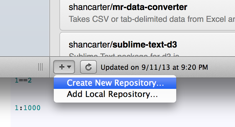
Name it “bar-chart” and save it in the “dataviz-fall-2013” folder.
Getting started with the R console
R isn’t hard, but it can feel difficult because it’s picky. The difference between a map or chart that works and one that’s broken can sometimes just be a missing argument to a method (like stringsAsFactors=F or horiz=T), which can be frustrating. Rather than try to cover all of these exhaustively, we’ll just start making some projects and learn as we go.
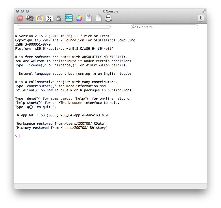
You should have R or RStudio installed on your machine or desktop. If you don’t, install it and run it form the applications menu. You should see the R console, which looks like this:
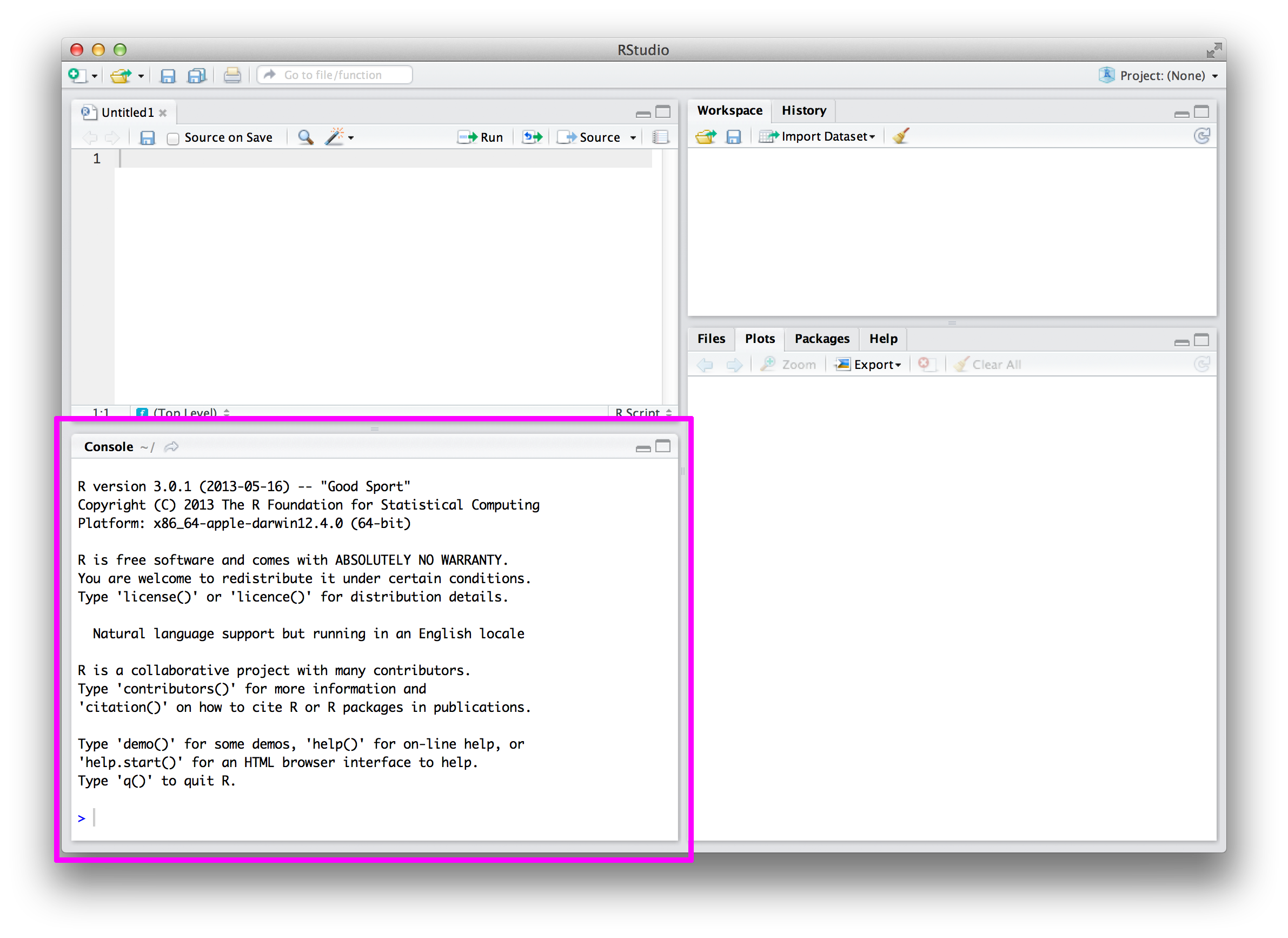
If you have RStudio instead of this basic R console, that’s fine too. Each has its merits.
Inside your
bar-chartsfolder, make a new file calledtutorials.Rin a text editor and save it. Start by typing your working directory in your R text file and pasting it into the R console.setwd("~/dataviz-fall-2013/bar-chart") #or wherever you're keeping your codeStart typing things into the console and discuss what happens after each.
"I should exercise more."
1+1
1==2
1:1000
animals <- c("bears","monkeys","donkeys")
animals[1]
class(animals)
class(1==2)
class(1:1000)
Making a bar chart in R
The thing we need for any chart is data. Download this CSV of the cost of various cable channels per subscriber per month. Save it to your local project folder. (PS, do you know what a CSV is?)
Load the file under the variable name
pricesprices <- read.csv("subscription-prices.csv")Let’s try a few things, one at a time, and discuss:
class(prices)
dim(prices)
head(prices)
head(prices, n=20)
names(prices)
prices$X2013
prices$X2013[1:10]
class(prices$X2013)
?head
prices[1,]
prices[,1]
prices[,c("Network")]
prices[1:10,c("Network")]
Before we make any charts, let’s get to know our data. How many rows does it have? How many columns? What are other meaningful questions we could ask (or should probably know the answer to)?
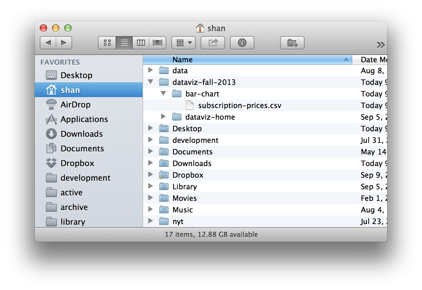
Let’s see what a basic plot of the prices looks like.
plot(prices$X2013)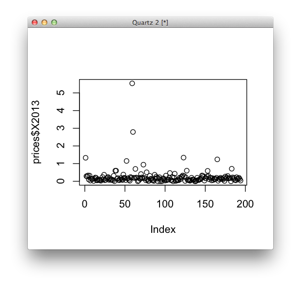
We only gave it one vector to plot, but it’s plotting on both X and Y coordinates. What does the X axis represent here? What does one dot represent?
That chart isn’t so fun. What order is our data in? Let’s sort our data frame in order from highest price to lowest. (This isn’t the most fun to write, but we resort a lot in R, so you this code will come in handy later.)
prices <- prices[order(prices$X2013, decreasing=T),]Now let’s do the same plot as before.
plot(prices$X2013)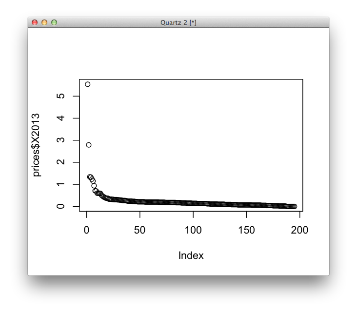
Try a different kind of plot (one R is kind of annoying about, actually).
barplot(prices$X2013)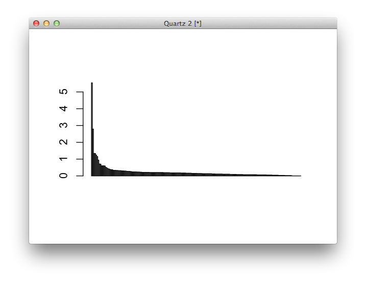
Note the difference here in the X axis. Which plot do you prefer?
Note that you can give all sorts of arguments to the plot commands. Take a look through the docs with
?plot. Here’s the same plot as before, but with some extra arguments.barplot(prices$X2013, col="lightgrey", border=F, main="Total control!", ylab="Price")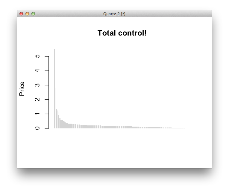
Let’s do a little logic and sorting, then replot.
#sorting
prices <- prices[order(prices$X2013),]
barcolors <- ifelse(prices$Network == "ESPN", "red", "lightgrey")
barplot(prices$X2013, col=barcolors, border=F, main="Now with custom colors!", ylab="Price")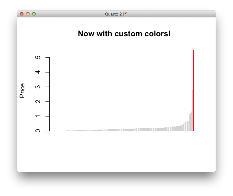
That’s it! You made your first data visualization in R. It’s not the best, but it’s only about three lines of code. In a hurry, you could post this online very quickly – Nate Silver probably would too. But it’s static and inflexible – what if you wanted users to be able to look up any station, or resize the chart based on which device a user was coming from? For increased flexibility, you might want to draw this chart in a web browser.
If you want to learn more about any of the commands we ran, R has a convention for brining up the documentation of any method.
#? then the name of the method
?plot
?barplot
##or, if you want fuzzy matching, try this
help.search("bar plot")
Getting started with the Javascript console
Close your R files for now and create a blank HTML page like the one described by Scott Murray in his great D3 tutorial. You can download that file right here, but make sure you save it (by right clicking on the link and choosing “Save Link As…”) to your local directory. Name the file
index.html.
Before we start coding, let’s get set up in the Terminal by starting a server on port 8000 using Python’s SimpleHTTPServer. To do this, open the terminal app, and then navigate to the folder that contains your empty html page by typing the following command.
cd ~/dataviz-fall-2013/bar-chart/Then type:
python -m SimpleHTTPServerThis sets up a simple server to mimic the real world internet so your browsers doesn’t barf when you try to do stuff.
Now we’re ready to start coding. Your
index.htmlfile is now accessible by going to localhost:8000 in your web browser.Open your
index.htmlpage (which might be blank, which is fine) and open the Console. (View > Developer > Javascript Console.) Typed3in the console and see what you get. You should get a response that says you loaded D3 successfully.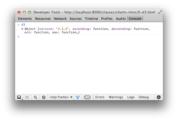
Let’s try typing the same things we did with R earlier, and note the small differences.
"I should exercise more."

1+1

1==2

1:1000 // doesn't work

animals = ["bears","monkeys","donkeys"] // new array syntax

animals[1] //note zero-based

typeof animals //not "class"

typeof (1 === 2)
The Javascript Console is going to be one of our best ways to inspect and debug the HTML, CSS and Javascript we write. The sooner you get comfortable with it, the better.
- Inside your script tag, let’s write some Javascript using D3. First, let’s add a headline:
d3.select("body").append("h1").text("My first bar chart")What just happened?
Now let’s add an SVG element to the page with the margin conventions described by Mike Bostock, the creator of D3. Basically, this code tells your browser to draw a big box (an SVG element) on the page. We’re going to draw a chart inside this box. The
marginstuff seems confusing at first, but these are the fiddly bits Hadley is describing, so if we want to learn D3, we need to do the fiddly stuff.var margin = {top: 20, right: 10, bottom: 20, left: 10}; var width = 600 - margin.left - margin.right, height = 250 - margin.top - margin.bottom; var svg = d3.select("body").append("svg") .attr("width", width + margin.left + margin.right) .attr("height", height + margin.top + margin.bottom) .append("g") .attr("transform", "translate(" + margin.left + "," + margin.top + ")");Use the Chrome inspector to see if your code worked. If it did, you should have an SVG element on your page.
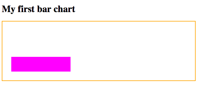
Let’s add a plain rectangle to the SVG element just to get used to the syntax.
var testRectangle = svg.append("rect")
.attr("x", 20)
.attr("y", 100)
.attr("height", 50)
.attr("width", 200)
.attr("class", "testbar");
Make a CSS block on the top of your
index.htmlpage to style your rectangle.<style type="text/css"> svg { border: 2px solid orange; } .testbar { fill: #ff00ff; } </style>It might look like this. (Here’s a working page if you want to take a look.)
What do the x and y positions we set mean?
Obviously, this is just a random rectangle and we need it to be a bar chart that represents our data. Let’s connect data to our document using D3.
Making a bar chart in D3
To load your data, add this code:
javascript
d3.csv("subscription-prices.csv", function(err, prices) {
console.log(prices);
});
Check out your Inspector. Did your data load correctly? If so, it might look like this: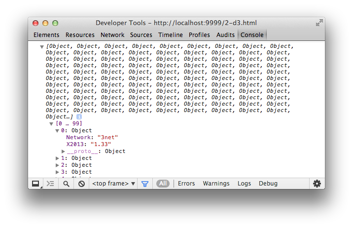
What is the data type of
X2013? How might we fix it?Before our
console.logcode, add this, which should help turn our data from a string into a number.prices.forEach(function(d) { // recasts d.2013 as a number, not a string d.X2013 = +d.X2013; })Go back to the inspector and check out the difference. Why does this matter?
We’re now going to do one of the most powerful applications of D3: the data join. We’re going to join the data we loaded to elements on the page. This is a little abstract, but it’s described well in Scott Murray’s tutorial section and more abstractly by the boss himself in this article.
var bar = svg.selectAll(".bar")
.data(prices)
.enter().append("rect")
.attr("class", "bar");
Check out your Chrome inspector now. You should see something like this:
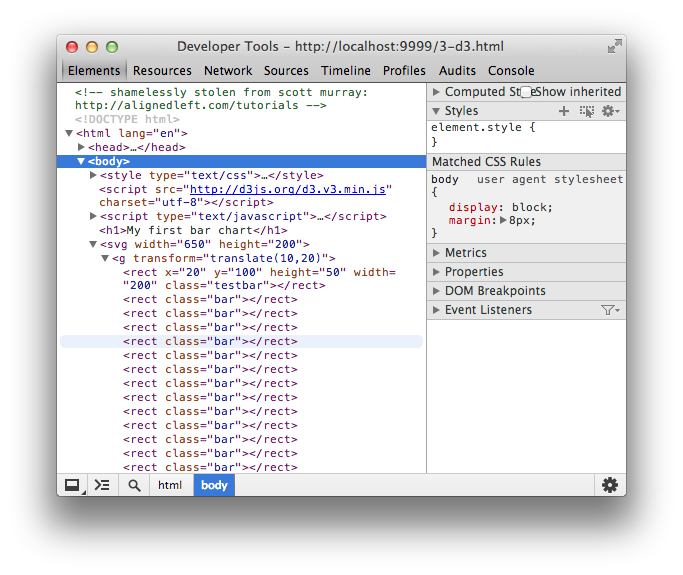
Why do we see it in the Inspector but nothing renders on the page?
Let’s give bars some attributes, like heights, widths, X and Y positions. To do that, though, we’ll need ways to translate our data values into pixels based on our SVG element. We do that with
d3.scale(a very good helper is, again, on Scott Murray’s site for further reading).var y = d3.scale.linear() .domain([0,6]) .range([0,height]); var x = d3.scale.linear() .domain([0,prices.length]) .range([0,width]);Let’s make sure we know what this code does before moving on.
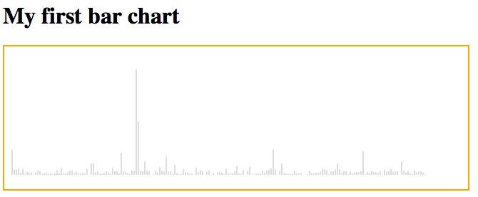
Let’s modify the code to give height and x positions based on our data. Only two lines of this are new.
var bar = svg.selectAll(".bar")
  .data(prices)
.enter().append("rect")
  .attr("height", function(d) { return y(d.X2013); })
  .attr("width", 2)
  .attr("x", function(d, i) { return 3 * i})
  .attr("class", "bar");
Add some css so the bars are grey, too.
.bar {
fill: #ddd;
}
If your chart looks like this, you’re in good shape.
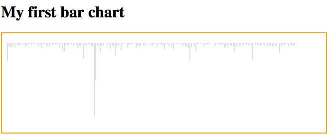
If you want to see this file, you can check it out here. What’s still wrong with this plot? What needs adjusting?
Let’s modify the
yattribute to get them all on the same baseline.var bar = svg.selectAll(".bar") .data(prices) .enter().append("rect") .attr("width", 2) .attr("height", function(d) { return y(d.X2013)} ) .attr("y", function(d) { return height - y(d.X2013) }) .attr("x", function(d, i) { return 3 * i}) .attr("class", "bar");It should look sort of like this:
We’re getting closer, but we still should have our data sorted. Under the block where we cast
X2013as a number, add this code. (Sorting in JS has never been fun, and even after 5 years this syntax is weird to Kevin.)prices.sort(function(a,b) { return a.X2013 - b.X2013; });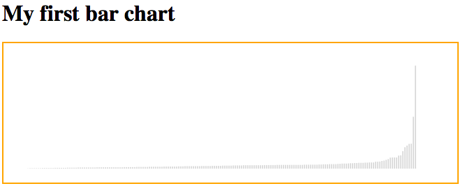
As a last step, we’ll add a class that highlights ESPN. This says, “If the network is ESPN, class it g-ESPN. Otherwise do nothing.”
var bar = svg.selectAll(".bar")
  .data(prices)
.enter().append("rect")
  .attr("width", 2)
  .attr("height", function(d) { return y(d.X2013)} )
  .attr("y", function(d) { return height - y(d.X2013)  })
  .attr("x", function(d, i) { return 3 * i})
  .attr("class", "bar");
.classed("g-ESPN", function(d) { return d.Network == "ESPN"})With corresponding CSS
.g-ESPN {
  fill: red;
}
svg.append("text")
.attr("class", "g-label")
.attr("x", 530)
.attr("y", 30)
.text("ESPN")
With some styling and small tweaks of the height, you can make it look like this:
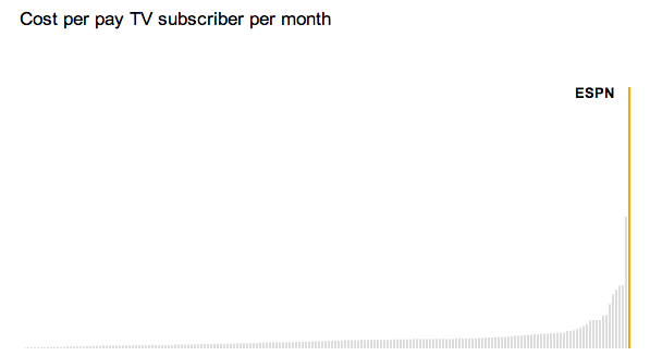
Try to get there on your own, and if you want to give up you can consult this finished file.
Homework
For your homework, you should make this bar chart as much like the one the NYT eventually published as you can. You’ll need to learn some new things to do it, but your professors and the internet can help you. This should be checked into git as its own repo.
Under this chart, write three other news-related questions or sentences you might have after viewing this chart that would be the basis for more reporting or requests for other data. For example, one of them might be, “Why do so many channels cost nothing?” or “How have these prices changed over time? It might be interesting to see whether ESPN’s growth happened sharply or slowly” or “Even though they’re not part of the standard cable package, how would a channel like HBO compare?
This homework must be completed and checked in by Tuesday, September 17 at noon. It should be linked to from your main index page.
Useful links
An axis component block.
Scott Murray’s tutorial, already referenced a few times here, covers axes and coloring too.